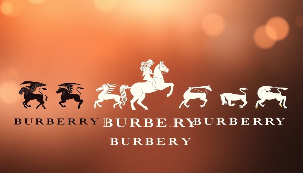
Burberry's logo has a rich history, starting with the iconic equestrian knight introduced in 1901. This emblem reflects the brand's commitment to heritage and luxury. You'll see significant changes over the years; from the simplifications in 1968 to the bold sans-serif type of 2018, each redesign mirrored modern trends. The 2023 logo by Daniel Lee reinstated the knight, showcasing electric blue and the word "Prorsum," emphasizing a balance between tradition and contemporary appeal. As Burberry navigates its evolution, you'll discover how these shifts shape its identity and connection with consumers today.
Key Takeaways
- Burberry was founded in 1856, with its first logo featuring an equestrian knight introduced in 1901, symbolizing the brand's heritage.
- The logo underwent significant changes in typography and imagery, transitioning from ornate designs to a modernized silhouette between 1968 and 1999.
- A notable 2018 redesign shifted to bold sans-serif text, reflecting contemporary design trends while moving away from traditional elements.
- The 2022 redesign reinstated the equestrian knight emblem, combining nostalgia with a fresh serif typeface to reinforce brand identity.
- In 2023, the logo returned to the equestrian knight, emphasizing heritage with new colors and the word "Prorsum," showcasing Burberry's commitment to authenticity.
Early Origins and First Logo
The early origins of Burberry trace back to 1856 when Thomas Burberry founded the company in Basingstoke. This venture initially focused on outdoor clothing, reflecting the needs of British aristocrats. By 1879, Burberry innovated with Gabardine, a tightly-woven fabric that set the brand apart. The first Burberry store opened in London in 1891, marking a pivotal moment in its journey.
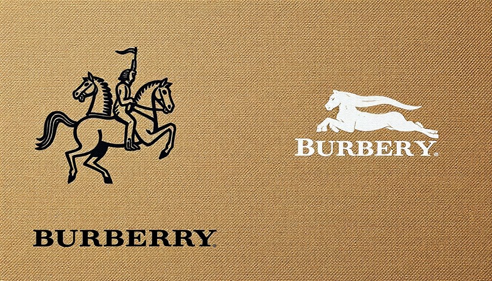
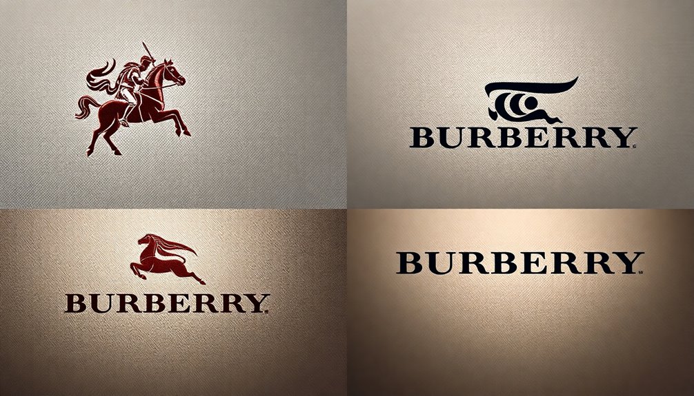
In 1901, Burberry unveiled its first logo, featuring an equestrian knight on horseback, symbolizing honor, protection, and grandeur. The knight carries a shield inscribed with the Latin word "Prorsum," meaning "forward," which signifies the company's commitment to progress. Below the emblem, the brand name appears in a classic serif font, enhancing its prestigious appeal. A strong logo contributes to brand loyalty and recognition, further reinforcing Burberry's esteemed position in the fashion industry.
The original logo includes a striking red emblem, which helped establish a strong visual identity. This logo wasn't just a design; it was a reflection of Burberry's heritage and values. The crowd-sourced design process engaged the community and highlighted the brand's connection with its roots.
As the logo gained recognition, it became synonymous with Burberry, further solidifying its status in fashion history.
Evolution From 1968 to 1999
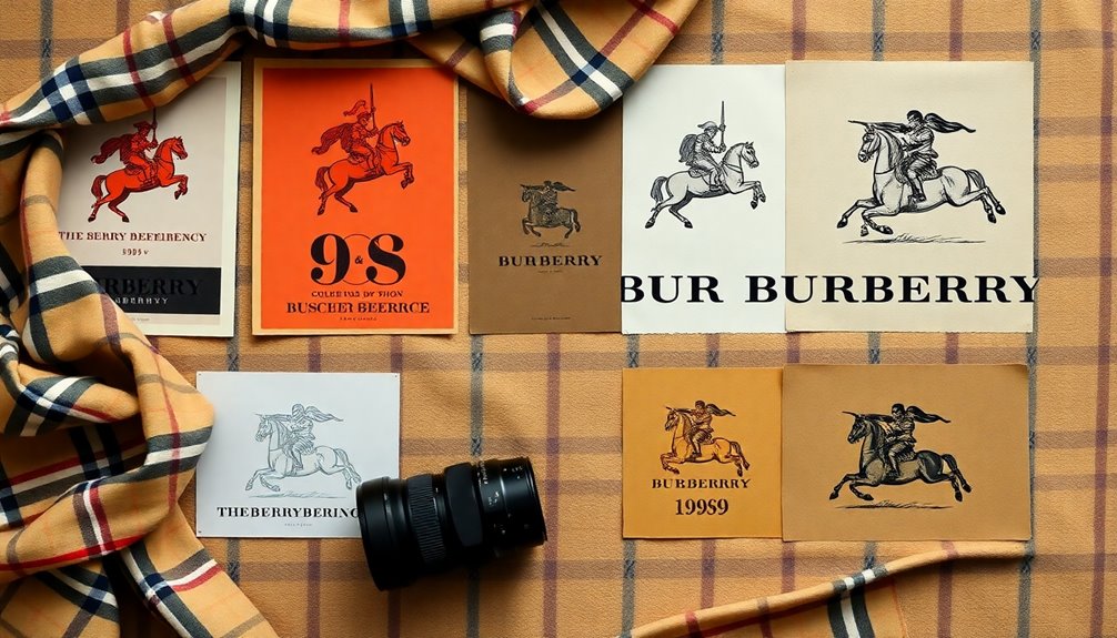
Evolving its brand identity from 1968 to 1999, Burberry embraced a modernized approach that significantly transformed its logo. The introduction of a simplified emblem reduced the equestrian knight to a miniature, abstract black silhouette, stripping away intricate details.
You'd notice that the wordmark took center stage, featuring "Burberrys London" in a sleek sans-serif font, with "Of London" displayed in uppercase letters beneath it. This shift toward an abstracted design emphasized a clean aesthetic, using a black color scheme that resonated with elegance and luxury.
The focus on typography allowed the brand name to shine, projecting an image that appealed to a younger, fashion-conscious audience. As you observe the changes, it's clear the logo maintained a balance between tradition and modernity, reflecting Burberry's growth while honoring its legacy. Furthermore, the logo's evolution in logo design showcases Burberry's commitment to excellence, reinforcing its position in the luxury fashion market.
Moreover, the redesign showcased the brand's adaptability to market trends, enhancing global recognition in a competitive landscape. By incorporating contemporary design principles, Burberry signified its commitment to quality and innovation, ensuring the logo's enduring appeal as a timeless representation of style and sophistication.
1999 Redesign and Heritage Revival
Burberry's 2022 redesign boldly marks a return to its rich heritage by resurrecting the iconic equestrian knight emblem from 1901. This emblem, featuring a horse-riding knight carrying a flag inscribed with "Prorsum," meaning "Forwards," symbolizes the brand's commitment to its roots. The equestrian knight was notably absent in the minimalistic 2018 redesign, making its return a significant statement about tradition.
Alongside the knight, Burberry introduced a new serif typeface, moving away from the previous sans-serif font. This typeface echoes the brand’s older wordmarks, particularly those used from 1968 to 1999, preserving nostalgia while adding a modern twist. The return of the equestrian knight design reflects a deeper connection to Burberry’s historical identity. The redesign also pays homage to Burberry’s rich heritage, further emphasizing the brand’s deep-rooted history and legacy. This strategic move is akin to the recent rebranding and revival of the history of Fendi, as luxury fashion houses embrace their traditional roots to attract a new generation of consumers. Overall, Burberry’s rebranding effort signifies a balance between tradition and innovation, solidifying its position in the fashion industry for years to come.
The combination of the knight and serif typography creates a balanced visual identity that honors the past while appealing to contemporary tastes.
The new logo and typography were unveiled through a vibrant campaign on Instagram, marking the first creative expression under Daniel Lee, the new chief creative officer. This global rebranding effort aims to reposition Burberry within the luxury market, emphasizing its unique heritage.
2018 Redesign Under Riccardo Tisci
Riccardo Tisci's redesign for Burberry in 2018 marked a bold departure from the brand's longstanding visual identity.
You'll notice that the new logo draws inspiration from a 1908 monogram for Thomas Burberry, unearthed from the archives. Collaborating with renowned graphic designer Peter Saville, Tisci completed the design process in just four weeks, showcasing a modern twist on historical elements.
The new logo features sleek, bold sans-serif text in all caps, simply stating "Burberry" without the traditional equestrian knight symbol. Below, "LONDON ENGLAND" appears in smaller text, giving it a youthful and contemporary feel.
One standout element is the new monogram, featuring interlocking 'TB' initials that pay homage to the brand's founder. The color scheme includes red, honey-beige, and white, reflecting a progressive image. This redesign is significant; it's the first new logo for Burberry in nearly two decades and reflects a blend of heritage and modernity was unveiled just before Tisci's inaugural runway show during London Fashion Week.
The updated identity signals Burberry's willingness to evolve and adapt, marking a new chapter in the brand's storied history.
2023 Redesign by Daniel Lee
A remarkable shift in Burberry's visual identity occurred with Daniel Lee's redesign as he took the helm as creative director in October 2022. His debut campaign, unveiled ahead of the February 2023 collection, marked a significant departure from the past. In a bold move, Burberry wiped its social media clean to launch this fresh narrative, focusing on the brand's British heritage and roots.
Lee's redesign brings a modern take on British luxury, emphasizing a new chapter for the brand. The updated logo reinstates the equestrian knight, a nod to the original 1901 logo, while introducing a lively electric blue, shifting away from the traditional flaming red. The inclusion of "Prorsum," which means "forward," pays homage to the brand's history.
The refined font and aesthetic create a blend of elegance and modernity. Shot by British photographer Tyrone Lebon, the campaign features iconic London locations and prominent British figures, reinforcing Burberry's heritage. This campaign also highlights the brand's commitment to sustainability initiatives, showcasing their focus on environmentally friendly practices in production.
This redesign not only revitalizes the logo but also showcases the brand's commitment to sustainability and carbon neutrality, aligning luxury with environmental responsibility.
Key Themes and Design Elements
The recent redesign by Daniel Lee not only revitalizes Burberry's logo but also highlights key themes and design elements that reflect the brand's identity.
The original 1901 logo, introduced by Thomas Burberry, featured an equestrian knight, symbolizing power and nobility. This imagery, along with the Latin word "Prorsum," represents the brand's equestrian roots and British heritage, emphasizing values like integrity and bravery. The logo serves as a testament to Burberry's rich heritage.
The knight, shield, and lance serve as powerful symbols of protection and reform, echoing traditional British aristocratic sports. As you observe the logo's evolution, you'll notice a shift from detailed imagery to a more abstract silhouette, showcasing modern simplicity while honoring the past.
Typography plays a crucial role too. The original ornate "B" transitioned to a serif typeface and later embraced a sans-serif design in 2018.
With the recent redesign, you see a return to serif fonts, connecting the logo to its historical roots.
Impact on Brand Identity
Burberry's logo evolution has profoundly influenced its brand identity, shaping how consumers perceive the luxury label. From the original equestrian knight introduced in 1901 to the bold serif logo designed by Peter Saville in 2018, each iteration reflected changing consumer tastes and fashion trends.
The simplification in 1968 aimed to modernize Burberry's image, while the 1999 redesign helped the brand shake off an outdated perception, positioning it as a trendsetter. As the brand navigated challenges, like its association with gang culture in the late 1990s, the logo changes were crucial in re-establishing trust and authenticity. Notably, the introduction of the iconic trench coat in the mid-1800s played a significant role in establishing Burberry's luxury identity. The return to the equestrian knight in 2023 reaffirms Burberry's commitment to its heritage, distinguishing it within a crowded market.
This balancing act between tradition and modernity is vital for maintaining consumer loyalty. By avoiding fleeting fads, Burberry has preserved its brand integrity, ensuring that it remains relevant while honoring its rich history.
Ultimately, the evolution of the logo illustrates Burberry's adaptability and its keen understanding of the luxury fashion landscape.
Frequently Asked Questions
What Inspired the Choice of Colors in the Burberry Logos?
The choice of colors in the Burberry logos reflects a strategic blend of symbolism and modernity.
You’ll notice the vibrant red in earlier designs representing power and nobility, while later iterations embraced a sleek black for sophistication and simplicity. The evolution of the color palette reflects the shifting values and priorities of the brand over time. As the company grew, it prioritized a more refined and sophisticated image, which is reflected in the transition to sleek black. This shift was also influenced by the changing tastes and preferences of our audience, as well as the guidance of our founder, beautyboss cassandra grey.
This evolution aims to resonate with contemporary audiences while maintaining a connection to heritage.
How Has Burberry's Logo Influenced Fashion Branding Trends?
Burberry's logo has significantly influenced fashion branding trends by blending tradition with modernity.
You'll notice how its elegant design communicates luxury and quality, setting a standard for others.
The logo's evolution shows brands can adapt while honoring their heritage, which resonates with consumers.
What Significance Does the Word "Prorsum" Hold for Burberry?
The word "prorsum" holds significant meaning for Burberry. It translates to "forward" in Latin, symbolizing the brand's commitment to progress and innovation.
When you see it on their logo, it reflects Burberry's heritage and dedication to quality. You'll notice how this emphasis on moving forward resonates with their designs, embodying a spirit of sophistication while staying true to their values.
It's a reminder of the brand's enduring legacy and forward-thinking mindset.
How Do the Logo Changes Reflect Shifts in Consumer Preferences?
The logo changes reflect your shifting preferences by showcasing Burberry's adaptability.
As you gravitate towards modern aesthetics, the brand simplifies its designs to resonate with your desire for minimalism and contemporary style.
Conversely, when you appreciate heritage, Burberry reintroduces classic elements, blending tradition with modern trends.
This back-and-forth illustrates their commitment to meeting your evolving tastes while maintaining a connection to their roots, ensuring they stay relevant in today's market.
What Role Does Cultural Heritage Play in Burberry's Logo Evolution?
Cultural heritage plays a crucial role in Burberry's logo evolution.
You'll notice how the brand's identity reflects its British roots and equestrian heritage through its designs. Each logo change honors tradition while adapting to contemporary tastes, ensuring relevance in today's market.
Conclusion
Burberry's logo journey reflects its rich heritage and adaptability. From the equestrian knight to modern interpretations, each redesign has captured the brand's essence while appealing to contemporary tastes. As you explore these changes, you can see how the logo not only represents the brand but also influences its identity in the fashion world. With each iteration, Burberry continues to blend tradition with innovation, ensuring its place as a timeless classic in luxury fashion.