
Your personal palette of colors can profoundly impact your mood and emotional well-being. Warm hues like red and orange boost energy and excitement, while cool tones such as blue and green promote relaxation and calmness. Your background and experiences shape how you respond to different colors, making your reactions unique. By choosing colors thoughtfully, you can create environments that uplift or soothe you. Keep exploring to discover how color choices can truly influence how you feel every day.
Key Takeaways
- Colors influence emotional states subconsciously, with warm hues energizing and cool tones promoting calmness.
- Cultural meanings of colors shape personal perceptions and emotional responses.
- Bright colors like yellow can uplift mood, while darker shades like blue may induce relaxation or melancholy.
- Physiological reactions to colors, such as heart rate changes, are rooted in evolutionary survival mechanisms.
- Selecting colors intentionally in environments can enhance mood, creativity, and overall well-being.

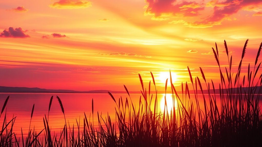
Have you ever noticed how a bright yellow room can lift your spirits or how a dark blue sky might make you feel calm or even a bit melancholic? Colors have a profound impact on your mood, often subtly influencing your emotions without you even realizing it. This connection stems from both psychological effects and cultural symbolism. When you surround yourself with specific colors, you’re not just choosing a shade; you’re engaging in a complex interplay of subconscious responses and learned associations that shape your feelings and behaviors.
Colors influence mood through subconscious responses and cultural meanings, shaping feelings without you realizing it.
Psychological effects of color are well-documented. For instance, warm hues like red and orange tend to energize you, sparking feelings of excitement or urgency. Conversely, cool tones like blue and green often promote relaxation and calmness. Your brain responds to these colors almost instantly, triggering physiological reactions—your heart rate might slow in a soothing teal, or your energy might spike with a vibrant red. These effects aren’t random; they’re rooted in evolutionary responses and personal experiences that your mind has linked with certain colors over time. Color psychology plays a significant role in how you interpret and respond to different hues, influencing your emotional state in subtle but powerful ways.
Cultural symbolism also plays a big role in how you interpret colors. In Western societies, white often symbolizes purity and peace, while in some Eastern cultures, it’s associated with mourning. Red can symbolize passion and love in one culture but danger or warning in another. When you choose colors for your environment or clothing, your cultural background influences how you perceive and respond to those hues. This symbolism shapes your emotional reactions, making certain colors feel comforting or threatening depending on your cultural context.
Understanding these influences helps you become more intentional with your color choices. For example, if you want to create a space that fosters creativity and energy, you might lean toward bold reds or vibrant oranges, knowing they can stimulate your psychological and emotional responses. If you seek tranquility, blues and soft greens can help reduce stress and promote a sense of peace. Recognizing the cultural symbolism tied to these colors can also guide you in selecting hues that resonate positively with your personal experiences and societal norms.
Ultimately, your mood and perception of a space are deeply intertwined with the colors you surround yourself with. They act as silent communicators, either uplifting your spirits or calming your mind based on their psychological effects and cultural meanings. By understanding this dynamic, you can craft a personal palette that aligns with your emotional needs, transforming your environment into a reflection of how you want to feel. Your choice of color becomes more than aesthetic; it becomes a powerful tool for shaping your mood and well-being.
Frequently Asked Questions
How Do Cultural Differences Influence Color Perception and Mood?
Cultural differences shape how you perceive color and mood through cultural symbolism and color associations. You might see white as purity in one culture but mourning in another. These varying meanings influence your emotional responses to colors. By understanding cultural symbolism, you better grasp why certain colors evoke specific moods, helping you communicate more effectively and appreciate diverse perspectives in color perception across different cultures.
Can Color Choices Impact Mental Health and Emotional Well-Being?
Yes, your color choices can impact mental health and emotional well-being. While vibrant reds may energize you, they could also increase anxiety, illustrating color psychology’s power. Soft blues might soothe your mind, fostering calmness, yet too much can cause sadness. You hold the power to influence your emotional responses through mindful color selection, transforming your environment into a sanctuary or a stimulant, depending on your needs and moods.
What Are the Best Colors for Promoting Concentration and Focus?
To promote concentration and focus, opt for blues and greens, as they are backed by color psychology for their calming and clarifying effects. Blue symbolizes trust and tranquility, helping you stay attentive, while green signifies balance and renewal. These colors naturally enhance your focus, reduce stress, and improve mental clarity. Incorporate them into your workspace to create an environment that encourages productivity and sustained concentration.
How Does Lighting Affect the Mood Created by Colors?
Lighting markedly influences how colors affect your mood, with studies showing that proper lighting can enhance color psychology effects. Bright, natural light makes warm colors feel more energizing, while soft, dim lighting creates a calming atmosphere for cool tones. By using lighting techniques like dimmers or spotlights, you control the mood created by your color choices, ensuring your space feels just right for your desired emotional tone.
Are There Specific Colors Recommended for Therapeutic Environments?
You should consider calming colors like soft blues, greens, and gentle neutrals for therapeutic environments, as they promote relaxation and reduce stress. Using color psychology and principles of color therapy, these hues help create a soothing atmosphere that encourages healing and comfort. You’ll want to avoid overly bright or stimulating colors, which can increase anxiety. Instead, choose colors that foster serenity and balance, supporting overall well-being.
Conclusion
Your personal palette is like a garden waiting to bloom, each color shaping your mood and vibe. When you choose your shades intentionally, you paint a life that reflects your true self—bright, calm, or bold. Remember, your colors are the brushstrokes of your mood, turning everyday moments into a masterpiece. Embrace your unique palette, and let it guide you to a more vibrant, authentic you. After all, your mood is the canvas—color it with confidence.