
If you’re exploring boho styles, earthy tones create a calm, grounded vibe with warm browns, muted greens, and sandy shades, reflecting nature and promoting tranquility. Conversely, jewel-tone palettes bring boldness and luxury with rich emeralds, sapphires, and amethysts, adding vibrant energy and opulence. Each approach offers a unique mood—so whether you prefer serenity or vibrance, you’ll discover how these color stories shape your space and style as you explore further.
Key Takeaways
- Earthy tones in Boho create a grounded, calming environment inspired by nature, while jewel tones evoke vibrant, luxurious energy.
- Earthy palettes use warm browns, greens, and beiges to promote serenity; jewel tones feature rich emeralds, sapphires, and rubies for boldness.
- Earthy Boho decor emphasizes natural textures, handcrafted elements, and organic materials; jewel-tone decor highlights layered textiles and ornate accessories.
- Earth tones foster a cozy, authentic atmosphere ideal for relaxation; jewel tones add opulence, excitement, and a sense of adventure.
- Both palettes reflect Boho’s eclectic style but differ in mood: earthy for tranquility, jewel tones for vibrant sophistication.

Have you ever wondered how colors shape your mood and perceptions? “Color Story” explores the fascinating ways hues influence our emotions, choices, and even our environment. When you consider the color palette for your space or wardrobe, you’re tapping into a powerful tool that can evoke feelings, set tones, and reflect your personality. Two popular styles in the bohemian world are earthy tones and jewel-tone palettes, each offering distinct vibes and style inspiration.
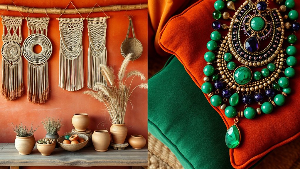
Earthy colors, like warm browns, muted greens, terracotta, and sandy beiges, create a grounded, calming atmosphere. These hues draw from nature, giving your environment a sense of serenity and authenticity. When you choose an earthy palette, you’re inspired by the natural textures and landscapes around you. Think of a boho living room with woven rugs, wooden furniture, and plants—these elements work together to cultivate a cozy, inviting space. Your style inspiration here leans toward organic materials and handcrafted pieces, emphasizing simplicity and connection to nature. The warmth of earthy tones can make your space feel more relaxed and approachable, encouraging comfort and mindfulness. Incorporating natural elements also aligns with transformative decor ideas that promote tranquility and serenity.
On the other hand, jewel-tone palettes—rich emeralds, sapphires, amethysts, and rubies—bring a luxurious, vibrant energy. These colors are bold and mesmerizing, instantly grabbing attention and adding a touch of opulence. When you incorporate jewel tones into your boho style, it’s about making a statement. Your style inspiration might include ornate textiles, layered accessories, and deep, saturated hues that add depth and richness to your decor or wardrobe. Jewel tones evoke feelings of excitement, creativity, and confidence. They’re perfect if you want to create a lively, glamorous atmosphere or express a sense of luxury and adventure.
Choosing between earthy and jewel-tone palettes ultimately depends on the mood you want to cultivate. Earthy tones foster calmness and harmony, ideal for a tranquil retreat. Jewel tones invigorate and energize, perfect for making a bold statement or adding a sophisticated touch. Both palettes serve as a foundation for your style inspiration, guiding your selections of furniture, decor, or clothing. Whichever you prefer, understanding how these hues influence your perception helps you craft a space and wardrobe that truly resonate with you. By thoughtfully integrating colors into your boho aesthetic, you can create an environment that reflects your personality and elevates your mood every time you step inside.
Frequently Asked Questions
Which Color Palette Suits a Minimalist Aesthetic Best?
You’ll want to choose a minimalist aesthetic that favors earthy tones, as they promote calm and simplicity through their neutral colors, aligning with color psychology principles. Opt for soft beiges, whites, and muted greens, which create a serene space. Use color combination tips by pairing these with subtle textures for depth. Jewel tones might be too bold for minimalism, so stick with subdued hues for a clean, understated look.
How Do These Color Schemes Influence Mood and Atmosphere?
These color schemes influence mood and atmosphere through color psychology and cultural associations. Earthy tones evoke calmness, stability, and a grounded feeling, while jewel tones add richness, energy, and luxury. Your choice impacts how you feel in a space; earthy shades promote relaxation, and jewel tones create vibrancy. Understanding these associations helps you craft environments aligned with your desired mood, making your space feel more intentional and emotionally resonant.
Can Earthy Tones Complement Jewel Tones in One Space?
Yes, earthy tones can complement jewel tones in one space, creating a rich and balanced color harmony. Some might think mixing these styles is challenging, but their natural contrast enhances design versatility. Earthy hues add warmth, grounding jewel tones that bring vibrancy. When combined thoughtfully, you achieve a sophisticated, inviting atmosphere that showcases your style’s depth and personality, making your space both lively and harmonious.
What Accessories Work Well With Each Color Story?
You can enhance both color stories by layering textures and mixing patterns. For earthy tones, opt for woven baskets, wooden accents, and linen pillows to add warmth. With jewel tones, choose metallic accessories, velvet cushions, or beaded jewelry to create a luxe vibe. Mixing patterns like florals with stripes or geometrics keeps the look dynamic. These techniques let you seamlessly blend accessories that complement either earthy or jewel-tone palettes.
Are There Specific Seasons That Favor These Color Palettes?
You’ll find that earthy palettes thrive in fall and winter, aligning with seasonal color trends that emphasize warmth and coziness, influenced by the fashion cycle’s emphasis on layered, muted tones. Conversely, jewel-tone boho looks shine in spring and summer, when vibrant, rich hues reflect the lively, fresh spirit of those seasons. Embracing these seasonal trends helps you stay stylish and in sync with current fashion cycle influences.
Conclusion
Whether you favor earthy hues or jewel tones, embracing these boho color stories lets your personality shine. Did you know that 65% of people say their home colors influence their mood? So, choosing the right palette isn’t just about style—it’s about creating a space that energizes and calms you. Immerse yourself in these vibrant worlds and craft a space that truly reflects your vibe. After all, your surroundings should be as unique as you are.