
To mix global patterns without creating visual overload, focus on balancing bold motifs with subtle elements. Start small by using one or two dominant patterns and complement them with solid colors or understated textures as visual rest areas. Keep a cohesive color palette across all patterns and vary their scale to create contrast and harmony. This approach guarantees a lively yet balanced look—keep exploring for even more tips to master pattern harmony seamlessly.
Key Takeaways
- Start with one or two dominant patterns and complement with solid colors or subtle textures for balance.
- Use cohesive color palettes, such as muted tones or monochromatic schemes, to unify contrasting patterns.
- Pair large, bold patterns with smaller, delicate motifs to create contrast and prevent visual overload.
- Incorporate rhythm and proportional scaling to ensure patterns breathe and maintain visual harmony.
- Add visual breather zones with solid colors or understated textures to anchor busy patterns and enhance cohesion.
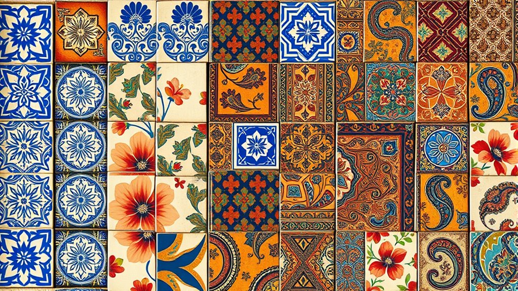
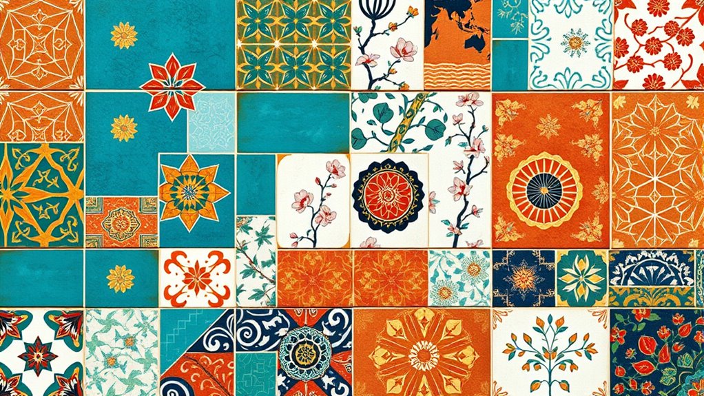
Global patterns are increasingly blending as interconnectedness accelerates across cultures, economies, and environments. This merging creates vibrant opportunities to incorporate diverse influences into your space or design, but it also presents a challenge: how to achieve pattern harmony without overwhelming the senses. When done thoughtfully, mixing global patterns can celebrate cultural blending while maintaining visual balance. Your goal should be to create a cohesive look that feels lively and dynamic without feeling chaotic.
To start, focus on understanding the concept of pattern harmony. It’s about balancing different motifs, colors, and textures so they complement each other rather than compete. Think of it as a conversation between patterns rather than a shouting match. For example, pairing a bold, geometric African print with a subtle, intricate Asian motif can work beautifully if you keep the color palette consistent or harmonized. Muted tones or monochromatic schemes can unify contrasting patterns, preventing visual overload. You want each pattern to stand out on its own but also to contribute to a harmonious whole. Incorporating visual balance principles can further enhance this harmony by guiding how elements are distributed within the space.
Achieve pattern harmony by balancing motifs, colors, and textures for a cohesive, lively space.
Cultural blending in pattern mixing means you get to tell a story—your story—by bringing together influences from around the world. But to keep this story engaging and not overwhelming, it’s best to start small. Use one or two dominant patterns and balance them with solid colors or understated textures. For instance, a richly patterned throw pillow or rug can anchor the room, while simpler accessories act as visual breather zones. This approach allows the eye to rest and appreciate each pattern’s unique character without feeling bombarded. Additionally, incorporating vetted design principles can help you select patterns and colors that work well together and maintain harmony, preventing discordant combinations.
Another tip is to pay attention to scale. Large, bold patterns can dominate a space and risk overwhelming your entire design if not balanced correctly. Pair large-scale patterns with smaller, more delicate motifs to create contrast and visual interest. This contrast enhances pattern harmony by giving each element room to breathe. *Furthermore*, consider the rhythm created by repeating patterns or motifs; a consistent rhythm guides your eye naturally across the space, reinforcing unity despite diversity. Incorporating design rhythm and proportional scaling can also help ensure the patterns work well together and maintain harmony.

United States Soccer Icon Navy USWNT Officially Licensed T-Shirt
US Women's Soccer design. Officially Licensed U.S. Soccer Federation apparel.
As an affiliate, we earn on qualifying purchases.
Frequently Asked Questions
How Do I Choose Patterns That Complement Each Other?
When choosing patterns that complement each other, you want to focus on pattern repetition and texture layering. Start with one dominant pattern and add others that share similar colors or motifs to create harmony. Mix different scales carefully, balancing bold and subtle designs. By repeating key elements and layering textures thoughtfully, you avoid visual overload while achieving a cohesive, stylish look.
What Color Schemes Work Best for Mixed Patterns?
Think of your patterns as a symphony, where color schemes are the conductor’s baton guiding harmony. To achieve visual balance, stick to a cohesive palette like neutrals with pops of bold hues or analogous shades that flow seamlessly. Color harmony guarantees your mixed patterns don’t clash but dance together gracefully, creating a vibrant yet harmonious space. Trust your eye, and let balanced colors be the glue that unites your eclectic design.
Are There Specific Styles Suited for Pattern Mixing?
You should focus on styles that emphasize pattern repetition and texture contrast to create visual harmony. Opt for designs that incorporate consistent motifs or color schemes, ensuring the patterns complement rather than clash. Styles like eclectic or bohemian work well because they embrace diverse patterns with intentional repetition. Use varying textures to add depth, but keep the overall look balanced to avoid overwhelming your space or outfit.
How Can I Balance Scale Differences in Patterns?
Did you know that balancing scale differences can make or break your pattern mix? To achieve scale harmony, start with one large pattern and pair it with smaller ones for contrast. Varying pattern scales creates visual interest without overload, so keep dominant patterns in check and use smaller, subtler designs to complement. This approach guarantees your pattern contrast remains engaging yet balanced, making your overall look cohesive and stylish.
What Accessories Can Enhance a Mixed-Pattern Look?
When you want to elevate a mixed-pattern look, accessories play a key role. Focus on accessory pairing by choosing simple, complementary pieces that don’t compete with your patterns. Statement pieces like bold earrings or a standout bag can add flair without overwhelming. Keep other accessories minimal to balance the look. This approach guarantees your patterns shine while the accessories enhance your overall style, creating a cohesive and eye-catching outfit.

America Soccer Fans Jersey - United States Football Lovers T-Shirt
US flag soccer - summer sports design for any proud soccer fan and football lover of the United...
As an affiliate, we earn on qualifying purchases.
Conclusion
You now hold the brush to blend global patterns seamlessly, like a painter merging vibrant colors on a canvas. When you balance complexity with simplicity, you create a tapestry that’s rich yet clear, inviting viewers to explore without feeling overwhelmed. Remember, it’s about guiding the eye gently through the design, much like a breeze weaving through trees—subtle, harmonious, and full of life. Embrace this harmony, and your work will speak with effortless elegance.

adidas Men's World Cup 26 Official Match Ball Graphic Long Sleeve T-Shirt, White, Medium
WORLD CUP 26 GAME BALL GRAPHIC STANDS OUT: This men's long-sleeve tee shirt features the official tournament ball...
As an affiliate, we earn on qualifying purchases.

Myswunder USA Soccer Fan Scarf - Double-Sided Team USA Supporter Scarf for 2026 International Soccer Matches & Game Day
[Double-Sided Support Design]: This USA soccer scarf is designed specifically for American supporters, featuring two distinct sides so...
As an affiliate, we earn on qualifying purchases.